The launch of dark mode on iPhone and Mac OS, as well as its availability on Android devices and on common services like Slack, have taken dark mode mainstream. The team at Dyspatch thought it was a good time to investigate how exactly dark mode is affecting email. The results of this investigation may surprise you…
Why should EVERY email marketer care?
Every email sender knows how much time and money are spent on ensuring the emails we send are pixel perfect, so the implications of an email client inverting your text and background colors willy nilly — yikes!
The most basic implication is accessibility. What if folks can no longer read the copy in your email? (Spoiler: we found cases where this happened). Worse, what if your call to action is now hidden? (Spoiler: we’ve also found evidence of this, too). Dark mode is definitely the biggest monkey wrench thrown at email marketers in the last few years.
Where there’s fear there is hope though — our team dug into the whole mess to make sense of it, and provide some real insight to where the danger is, and how you can prepare. Buckle up!
A Quick Primer
First, a quick primer on dark mode and how it impacts email. Simply put, dark mode means the inversion of colours on a phone or computer so that you’re using a dark background against lighter text. The purported benefits are reduced eye strain, potentially less power consumption, and subjective aesthetics (some folks just think it looks better)!
Since most HTML emails are designed to have a white background, Google and Apple decided these would look mighty funny if the rest of the screen was set to dark mode, and thus decided emails would be converted automatically to match dark mode.
For regular emails sent by a person, this isn’t a big deal because most humans don’t apply much formatting to their emails aside from font size. For email marketers on the other hand, who design HTML emails that match the look and feel of their website or app, this automatic conversion to dark mode poses serious issues.
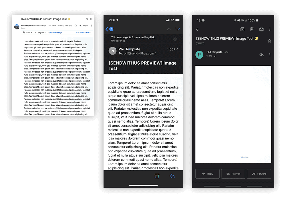
What are the actual effects?

The impact of dark mode on Gmail – note the call to action on the yellow button
Referring to research by our friends at Litmus, there are 3 different ways an email may be rendered in dark mode:
- No color change – yes, you read that right. Some email clients don’t change emails at all in dark mode, which can leave you with illegible text.
- Partial color invert – this is when the client only detects areas with light backgrounds and then inverts them so the light backgrounds are dark. In these cases, dark text is also inverted to dark. Anything already on a dark background is left as is. The result is your branding elements, from colors to logos, being manipulated in unpredictable ways.
- Full color invert – in this scenario, all colors in the email are inverted, regardless of whether they’re already dark. This is definitely the most invasive change, and it’s also one of the most popular approaches, which poses serious problems for email marketers.
In the notes, we’ll have a full listing of dark mode email client support, also courtesy of the good folks at Litmus.
Sidebar; Dark Mode and Interactive Email
I just wanted to take a minute and address how this effects interactive or kinetic email. The impact of color inversion is only on the colors, it doesn’t impact any of the underlying HTML or non-color CSS styles. This means that any of the interactive elements you’ve built in will work just fine. You will need to pay attention to contrast, backgrounds, and ensure that transparent images are used properly.
Danger! Background images and background gradients
By far the most explosive finding of our investigation was how Gmail alters emails with a background image or a background gradient on text. Gmail on Android is supposed to do a partial color invert.
We tested two real-world scenarios for marketing emails:
- Having a background image with text on top
- Having a background gradient with text on top
On to the results…
Background Images
Gmail on Chrome / Gmail on iPhone / Gmail on Android
As you can see above, the unaltered email ( left) shows a background image with a slight white-to-blue gradient. On iPhone (center), the background image has been removed but otherwise the email is fully readable. Finally, in Gmail on an Android device (right), it appears that the background image has been preserved but the text has been inverted from black to white, making it completely invisible. We’re still investigating safe ways to use background images when sending to Gmail, but at this time we must highlight the need to test this specific configuration before sending.
Background Gradients

Gmail on web / Gmail on iPhone / Gmail on Android
Similar to the previous results, we see the experience on Gmail Web (unaltered) and iPhone is nearly identical. Once again, Gmail on Android is extremely problematic in that the text is inverted from black to white, making it nearly illegible on the gradient background.
Admittedly, this a cherry picked gradient, which we selected to highlight the risks. But it is fairly alarming to see these results considering that gradient backgrounds have become popular in HTML email, and client support is rising.
Our recommendation is to use text in images instead of text on a background image or gradient at this time. This is definitely a step backwards from both an accessibility and email technology perspective, but ensuring that you specify alt text for your image will help balance the trade-offs. In the next paragraphs, we’re answering some of our customers’ most common questions about how to adjust some of their email creation tactics to ensure a smooth experience for users who have their device set to dark mode. If you have questions we didn’t cover, let us know and we’ll get back to you.
Question 1 – When does dark mode get applied to an email?
Broadly speaking, there are three ways dark mode may be applied to your emails.
First, in Apple email clients (Apple Mail, iOS Mail) dark mode is only applied to “personal emails”. While it is incredibly difficult to find an exact definition for this term, to the best of our understanding personal emails are the ones that don’t contain any visible images. This means an HTML formatted email with an invisible tracking pixel would count as personal, but a traditional marketing email with a hero image would not. It’s also worth noting that plain text emails will always be considered personal emails.
In Gmail, dark mode inversion is applied automatically on mobile if the user is using dark mode. Either a full color inversion (Gmail iOS) or partial color inversion (Gmail Android) will be automatically applied. This is particularly scary given that Gmail is the most popular email client, being the top choice for approximately 27.8% of email users worldwide.
Outlook (mobile, web) follows the same approach as Gmail: dark mode is applied automatically. However, in Outlook Desktop,there is a toggle button where the user can enable dark mode. Frustratingly, dark mode is applied differently than in Gmail, so you won’t be able to guarantee that inverted emails will look the same in each client without testing each client individually.
Question 2 – Can you prevent dark mode from being applied to an email?
You can prevent dark mode from being applied to your emails if they are using anApple email client (like Apple Mail and iOS Mail) by ensuring that it isn’t perceived as a “personal email”. In other words, by making sure you have at least one visible image.
In Gmail and Outlook, unfortunately, there’s no way to prevent the automatic conversion from happening. The best we can do is plan for ᴉuʌǝɹsᴉou! I mean, inversion.
Question 3 – Can you specifically target dark mode with HTML or CSS?
Yes, there are two techniques for targeting HTML/CSS specifically in dark mode. This is a complex topic, so we’re not going to go into full detail here, but we will link to some great resources.
First, for Apple Mail, iOS Mail, and some versions of Outlook you can use the following media query:
@media (prefers-color-scheme: dark)
For the outliers (Outlook Android and Outlook.com) you may use can add the following as a prefix to CSS styles:
[data-ogsc] and/or [data-ogsb]
Unfortunately, Gmail (Android and iOS) does not support either of these techniques, nor does Outlook 2019 for Windows.
More information can be found on this great blog post from Campaign Monitor: https://www.campaignmonitor.com/resources/guides/dark-mode-in-email/
Question 4 – What are the biggest dark mode “gotchas” for email marketers?
As if HTML email wasn’t complex enough, sure enough the Internet found a way to make it more difficult. Here are our top takeaways:
- It goes without saying, but be sure to test your emails in dark mode prior to hitting “Send” — especially on Gmail
- Be sure your images are ready for dark mode: use transparent PNGs wherever possible and add a transparent outline around text in images so that the text will be highlighted if inverted
- Add dark mode meta tags and use the dark mode media queries to control the look and feel when inverted
- As highlighted above, be extremely careful with background images and gradients in Gmail, as it’s especially hard to ensure that the text will be legible
Takeaways
Sometimes it may feel like email technology takes two steps forward (AMP4Email, Interactive Email) and then one step backwards. I believe that in time, these edge cases around dark mode will be ironed out and dark mode will turn out to be a competitive edge for email marketers.
In the meantime, we’ll continue to investigate edge cases and new techniques to ensure all the hard work you put into making your emails look great pays off.
It’s worth noting that an email template builder like Dyspatch, which includes a modular design system, takes a lot of the sting out of pains like this. With Dyspatch, you can quickly apply module changes and theme updates to all your templates, mitigating any dark mode compliance issues extremely quickly. Plus, our underlying DML technology ensures that you don’t have to write custom code to maintain device compatibility — we stay on top of email client changes and guarantee your emails will be responsive and mobile-friendly.
If you’d like to learn more, our team is happy to help! Drop a note to hello@dyspatch.io.
DARK MODE EMAIL CLIENT SUPPORT CHART (AS OF NOVEMBER 2019)
Credit to Litmus.com for investigating client support: https://litmus.com/blog/the-ultimate-guide-to-dark-mode-for-email-marketers
| Email Client | HTML Treatment in Dark Mode |
|---|---|
| Gmail App (Android) | Partial color invert |
| Gmail App (iOS) | Full color invert |
| Outlook (Android) | Partial color invert |
| Outlook (iOS) | Partial color invert |
| iOS Mail | No color changes |
| Apple Mail | No color changes |
| Outlook 2019 (MacOS) | Partial color invert |
| Outlook 2019 (Windows) | Full color invert |
| Outlook.com | Partial color invert |
The post The Dangers of Dark Mode and Email – An Investigation appeared first on Dyspatch.